I had the concept for the film at the end of first year/early second year. Just the look of it popped into my head: A round cartoon character juxtaposed with straight and edgy abstract shapes. That's what I wanted my film to look like. The image was there but the full idea wasn't.
At the beginning of the second half of second year I quickly drew a concept drawing out since I didn't want the image I had in my head to go away. So here's that drawing from 2ish years ago!
Even that early on I already knew what I wanted in my thesis film. 5 things:
1 - Cartoon animation
Because I love it and have fun doing it.
2 - Motion graphics and moving shapes
Because I love graphic design.
3 - Music based (specifically big band)
Because I like old music and big band fits with cartoon animation acting as sound effects.
4 - No layout
Because I'm not good at it.
That's it! I wanted my film to be about everything I enjoy and I wanted it to play to my strengths. I didn't want to spend time on things I didn't like and things I wasn't particularly good at. My thought was that if I spent time on something I'm not good at, that is time away from improving on something that I want to be better at. I also wanted it to be 1 minute since during industry day they only show 1 minute of our films during the screening. I wanted a whole product on the screen and I also didn't want to overwork myself. 1 minute was already a ton of work for this film and I would have ripped my hair out if I did it any longer.
I also wanted to incorporate a bit of fine art into it because in the end I have a huge passion for art. When I saw Michel Gagne's
Sensology had imagery that resembled Wassily Kandinsky's work, I had a direction I wanted to take it to. Other works I referenced were iPod silhouette commercials, Day & Night by Pixar, Carnival of Animals from Fantasia 2000, The Dot and Line: A Romance in Lower Mathematics by Chuck Jones, UPA, Fleischer Bros., Piet Mondrian, Picasso, Saul Bass, and more that I probably missed.
Here are some stuff I made in 3rd year. Quick doodles that I made in order to get the idea across.
Although Kandinsky was my first idea, I experimented with boards and sketches with much more basic shapes. A lot of people suggested I simplify things and choose the basic shapes to make the workload a little easier for myself since I was already planning to fully animate characters for the total 1 minute. Which was a smart suggestion since in the end the workload I had was already enough and challenging for me. But I still think about how my film would have turned out with more elaborate Kandinsky style effects.
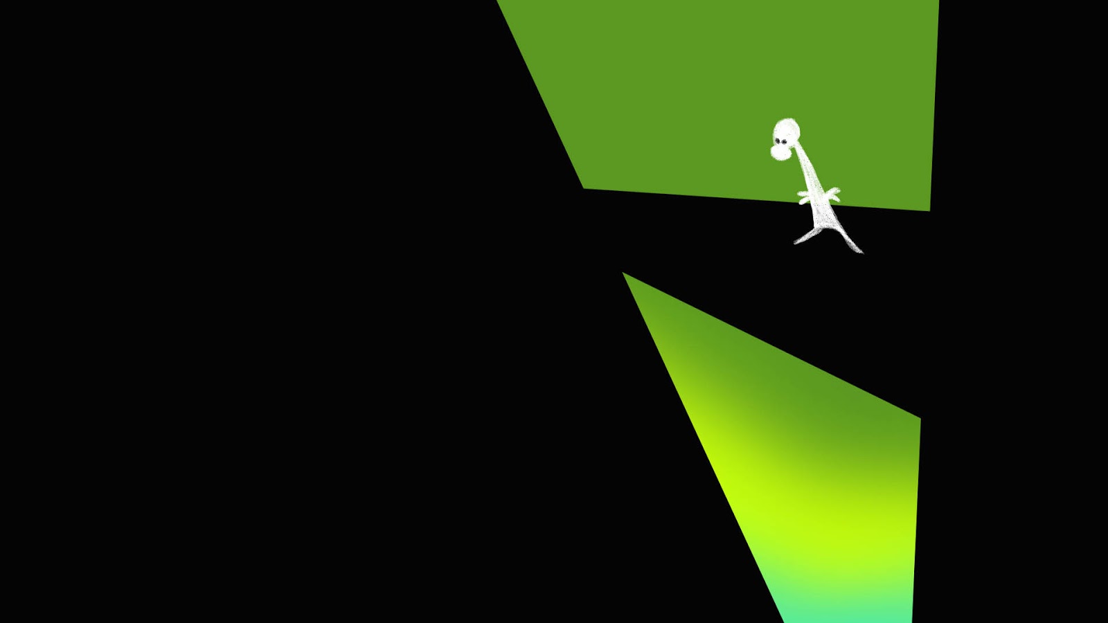
Here is the first image I made that incorporated the idea I had of using flat shapes to suggest perspective and only when placing the character in it would it give context. I created a rough storyboard sequence in 3rd year using this concept and my instructor suggested I take that idea further.
Progress Reel
Here's my progress reel! I locked down my storyboards by end of September and started animating in October. Other classes got in the way so full on animating didn't start until January to very early March. Clean up took the whole month of March and colouring was a breeze on Toonboom which took 3 days. My original plan was to finish in March but I took into account delays and revisions. I still managed to finish several weeks early! I also never pulled any all nighters and only worked at school from 9am - 9pm and took weekends off! I had to come in on weekends a few times during clean up, but apart from that I had a very healthy lifestyle in fourth year compared to my other three years. I felt great!
A few of my friends kept asking about how I time manage well. Here's the secret: JUST WORK ON YOUR FILM. Don't get side tracked. Fourth year was deceiving with all the "free time" you have with less classes, I just spent most of that working but still took time to have fun. So to any upcoming fourth years working on their thesis films and are reading this: work on your film as much as you can. Lock down your boards as soon as possible. Aim for something manageable and to your strengths. And most importantly sleep. Don't work tired, it will just make the work you output worse. Good luck!